I’m sharing my startup stories while building out my latest project – Calenzen – which seamlessly reformats meetings in your calendar so you can always instantly click to dial. No special apps, calendar programs, or software is ever needed. Learn more about Calenzen.
This Solution Needs a Problem
Soon after having kids, I quickly realized that they change a lot. This isn’t earth-shattering news at all, but I didn’t expect their interests to flip so frequently. As this played out the kids would fixate on new toys, leaving the old ones to gather dust in the basement.
I grew tired of stepping on the cast-offs that weren’t used anymore. When the kids would get something new it was always such a gamble. I worried whether the toy would break right away, or if it would be used for more than a few minutes.
That’s where the idea for Flip-a-toy came from. Buying all those toys new would be ridiculous and finding them used was as much of a pain as getting rid of your old ones. My idea was to create a localized marketplace for used children’s toys – think Craigslist for Toys.
Buyers on the site could discover toys based on age, gender, and most importantly location proximity. They were encouraged to register their kids’ gender and age to get alerts when new items were listed nearby.
I wanted close to zero friction for sellers, on the assumption that it would encourage a large inventory. This started with giving the sellers easy ways to list their offerings, one of them even including submitting tagged photos that could easily contain a dozen items or more.
Data describing items was another source of friction – categorizing, tagging, finding stock photos, and adding stock descriptions of items was a pain and would prevent many low-value items from ever landing on the site. I combatted this by ingeniously tying the listing process in with data sourced from Amazon. As soon as a listing was linked to a specific Amazon item, the site instantly gained access to a wealth of this metadata.
Revenue wouldn’t come from either the buy-side or the sell-side. Rather, the path forward was through commission from future Amazon purchases. As customers integrated with the Flip-a-toy web site, my algorithms built a customer profile that I used to customize a recommended product page. Any purchases of these recommended items via Amazon resulted in a commission.
Building the Web Interface
I wanted the entire experience to appeal to my target visitor persona. These were parents, often professionals, with young children. I expected that they wanted something that balanced a playful look but that also built trust and credibility by mirroring their own professionalism.
![]()
Learn more about how I developed this persona and the overall positioning for the brand from my piece “Logo Design for Impact” that builds on my experience designing the logo for Flip-a-toy when designing the Calenzen offering.
This project had a healthy time budget (no hard go-live dates, though sooner is always preferred) and funding to support bringing additional help on board. While I’ve used templates and the outstanding Bootstrap framework for more recent projects, those weren’t yet available at the time I was pulling this interface together.
I wasn’t going to start from scratch either, so I worked with a freelance agency that could collaborate to bring my rough wireframes into a finely tuned web site that expertly matched the brand image already coming together.

While the final product looked pixel perfect and included the exact color scheme and overall feel that I’d run by the target group, I’d soon discover it wasn’t without flaws. The site itself was rigidly defined, making further extensions very challenging. Modifying part of a layout or even changing the color of a link, required modifying stylesheets in dozens of locations. As I continued working with the site, I ultimately ended up with a second series of higher priority stylesheets to unify the look and make the site both easy to build and consistent to navigate.
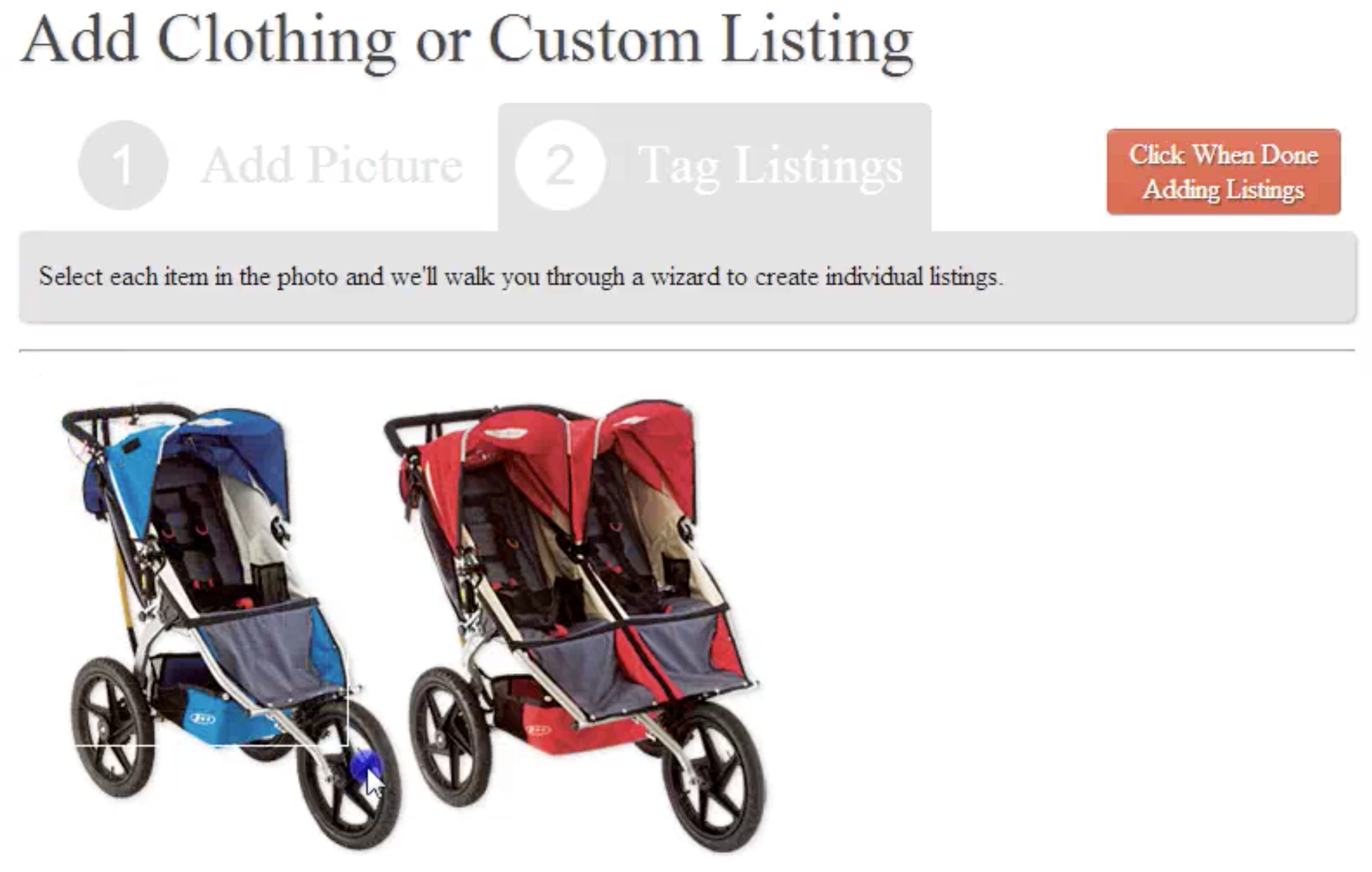
A big part of the challenge soon came from implementing new patterns that, at the time, were far from common. One very noticeable example was the picture management tooling. I wanted customers to be able to easily upload images, crop them, and also tag specific areas. The idea was to use a single quick photo that included a number of different products that could be extracted out using the tagging interface.
While this has been common for a number of years now after Facebook made it popular, that wasn’t always the case. No pre-built JavaScript frameworks existed. After many hours of coding, testing, and finding snippets of code with partial functionality, I’d finally built the right interface.
The Hidden Parts in the Back End
Most of the heavy lifting in the Flip-a-toy solution fell to the unseen backend. I made heavy use of Python in front of a MySQL database to drive both local maintenance activities and to obtain and enhance data from partners.
The Yin and Yang of Dependencies
The most important data came from Amazon APIs which supported both synchronous and asynchronous use cases. The most critical one was to drive data appending requirements. When customers listed or interacted with any listings, I made use of Amazon’s rich data – like product name, description, stock photos, appropriate ages, and similar products.
While this data held immense value, synchronous access added a third party dependency on the Flip-a-toy service. Nearly all API requests returned quickly, that wasn’t always the case. 2% of all calls exceeded 1.5 seconds to return. Given that my product pages could easily reference more than a dozen different products (including all the recommendations) this meant that once every few page loads I’d expect a slowdown.
Slowdowns have a much larger reverberating effect than many people initially realize. The most apparent impact is a poor user experience because the page returns too slowly, doesn’t render correctly, or needs to be reloaded. But that’s only temporal.
When pages take longer to deliver due to these downstream dependencies, the web server itself cannot process as many concurrent visitors. Remedying this by purchasing additional hosting capacity increases costs and complexity (e.g. two servers are harder to keep running, correctly, than just one).
The final impact of slow page load times, and the most challenging to mitigate, is the affect on Google (or other) search engine listings. Google ranks search results using a complex formula, but one component is page load time. An inconsistently delivered web site will reduce search engine visibility and therefore organic traffic.
Thankfully, all this risk could be easily mitigated by caching and prefetching this data asynchronously. It removes the third party dependency and reduces the time-cost of data to near zero. While the technical solution was easy to implement, keeping within data management policy took more finesse. That’s because Amazon gives access to this data for immediate use, not for permanent storage (keep in mind – Amazon provides this data as a way to increase sales).
After analyzing the policy, I determined data could be cached for up to 24 hours. This meant the first data access would be synchronous, all subsequent page views within a 24 hour period would be cached, and I could asynchronously pre-fetch the data at the end of 24 hours to maintain deterministic performance.
Harnessing the Power of my Database
As already mentioned, I wanted Flip-a-toy to be hyper-localized. Visitors wouldn’t be faced with an ad-hoc list of items like you would expect to see on Craigslist. By taking into account exactly where sellers and potential buyers lived, I could sort and filter listings very accurately.
I accomplished this by requesting that registered users provide at least their zip code. Potential buyers could also supply a location or, if one was not provided, could automatically narrow their location to a specific city by their computer address. Zip codes can be directly translated into longitude and latitude coordinates.
Given these coordinates I made sure all searches run through the database executed an efficient formula that calculated the distance between any two points on demand.
https://gist.github.com/keithresar/79e30bf4dd6c0efca137d3f882326d78
Keeping Visitors Connected with Fip-a-toy
The last piece of functionality in my initial version was a way to pull existing customers back to the site. Remember, my sole revenue stream came from commissions based on off-site sales at Amazon!
I created a batch job that searched for matches between item inventory and potential buyers. When there was a match between them, such as a new listing or a buyer’s child aged into a new category, the system crafted an outbound email. The email contained details on the match, but also included the same suite of recommendations that drove the live web site.
Launching to My First Customers
Launching was a local effort. Since Flip-a-toy required a marketplace, I needed to bootstrap both buyers and sellers on the system. This was best accomplished by focussing on a small area within one city before scaling any further.
I began by seeding the marketplace with listings. After an expensive trip to the used toy store, we had a few dozen listings active on the site.
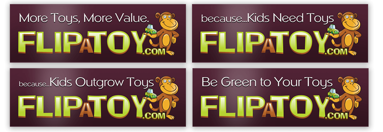
The next step was getting the word out. My first thought was that parents spend time near other parents. To make the connection, I printed out a number of bumper stickers and a few parents proudly showed them off.
The second outreach step was to look for locally oriented websites, newsletters, and parent communities. Where I found these, I reached out.
Unfortunately, neither of these efforts ultimately resulted in a sustainable marketplace populated with new sellers or enough buyers to successfully make the sales and matches needed for success. After a trial run, I shuttered the failed effort.
Everything’s Different the Second Time Around
More than a year passed between closing down Flip-a-toy and me discovering the missing piece that caused failure. After some due diligence, I began spinning the web service back up again.
The original domain flip-a-toy.com had expired and I no longer owned it, but a quick rename to play-swap.com was enough to get back online using tweaked branding. I added some new features and re-skinned the entire front-end.
I felt the original effort failed due to customer outreach and not a failure with product/market fit. Therefore, my time needed to be focussed on customer acquisition rather than any other tasks.
We all know the rules of thumb about display advertising, that it’s only the first step in a very leaky funnel and that multiple impressions are key to pulling in new customers. The first effort didn’t have enough presence or context to make this connection.
For my second attempt, I wanted increased visibility and something more actionable where parents visit. I printed out a beautiful glossy flier and attached custom printed post-it notepads to each. The idea was that the eye-catching design would draw in enough second glances to read the market pitch and a percentage of them would grab a sticky-note for future reference.
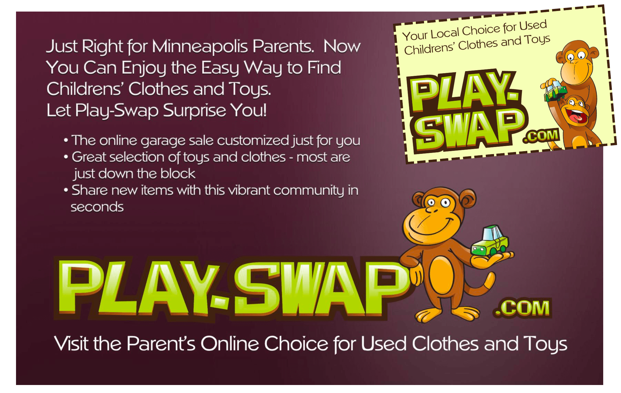
These were printed and distributed across preschools and daycares to get the most visibility from my target persona. Unfortunately, after a few months with no traction, I declared this effort a failure as well.
Lessons Learned
This was a tough project to fail on, especially after taking another run at it.
From a technical perspective, my takeaways were around the idea of increasing efficiency. By minimizing the effort required to prove the idea’s feasibility, I’m able to iterate more quickly. Investing in a custom designed web front-end wasn’t a great use of time and in retrospect would not have dramatically changed customer behavior at the top of the funnel where early proof metrics are so critical. Should the site have taken off, I would not have been locked into a corner and changes to improve conversion and performance could have been implemented on an ongoing basis.
I talked with parents in my target persona throughout the development process. Contrasting the reaction I’ve gotten from other projects (“I don’t get it,” or “why wouldn’t you do x instead”), feedback was overwhelmingly positive. Parents said the entire toy lifecycle was a pain point – new ones were too expensive, they weren’t used long enough, and variety was hard to maintain. This reaction played perfectly with the value prop I offered.
But how much can you trust feedback, whether from surveys or anecdotal conversations? When there’s a price attached to their feedback to use as a commitment device, such as requesting prepayment for the product that’s still in development, then you know it’s more than mere words. Given my Amazon commission based revenue stream this wasn’t an option.
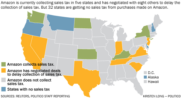
About the time I shuttered my second effort, that potential revenue source was suddenly blocked as well. Amazon was de-risking their potential sales-tax liability in states where they didn’t collect it by disabling all referral programs paying to addresses in the “red” no-go states. Minnesota was one of these as of 2013 (although this has long since changed).
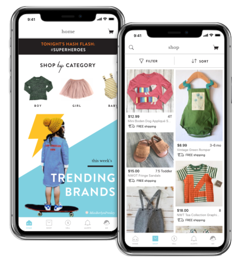
My final thought on this project is still a tinge of regret. Not long after Play-swap was shut down, a very similar project started up just down the street. They delivered the on the same promise – a frictionless marketplace for used kids toys and clothing. Their initial solution was app-based and pretty rough, but now many years later they have an awesome offering.
Want more? See a narrated walk-though of the ~2013 Play-swap web site below. I felt as though the site looked fantastic at the time, but with the help of hindsight this is incredibly dated.


